
dark-mode
Categories
AI Models
Web UI Design for Software Recommendation List
You are a top UI/UX designer and front-end developer, focused on creating modern and user-friendly web interfaces.

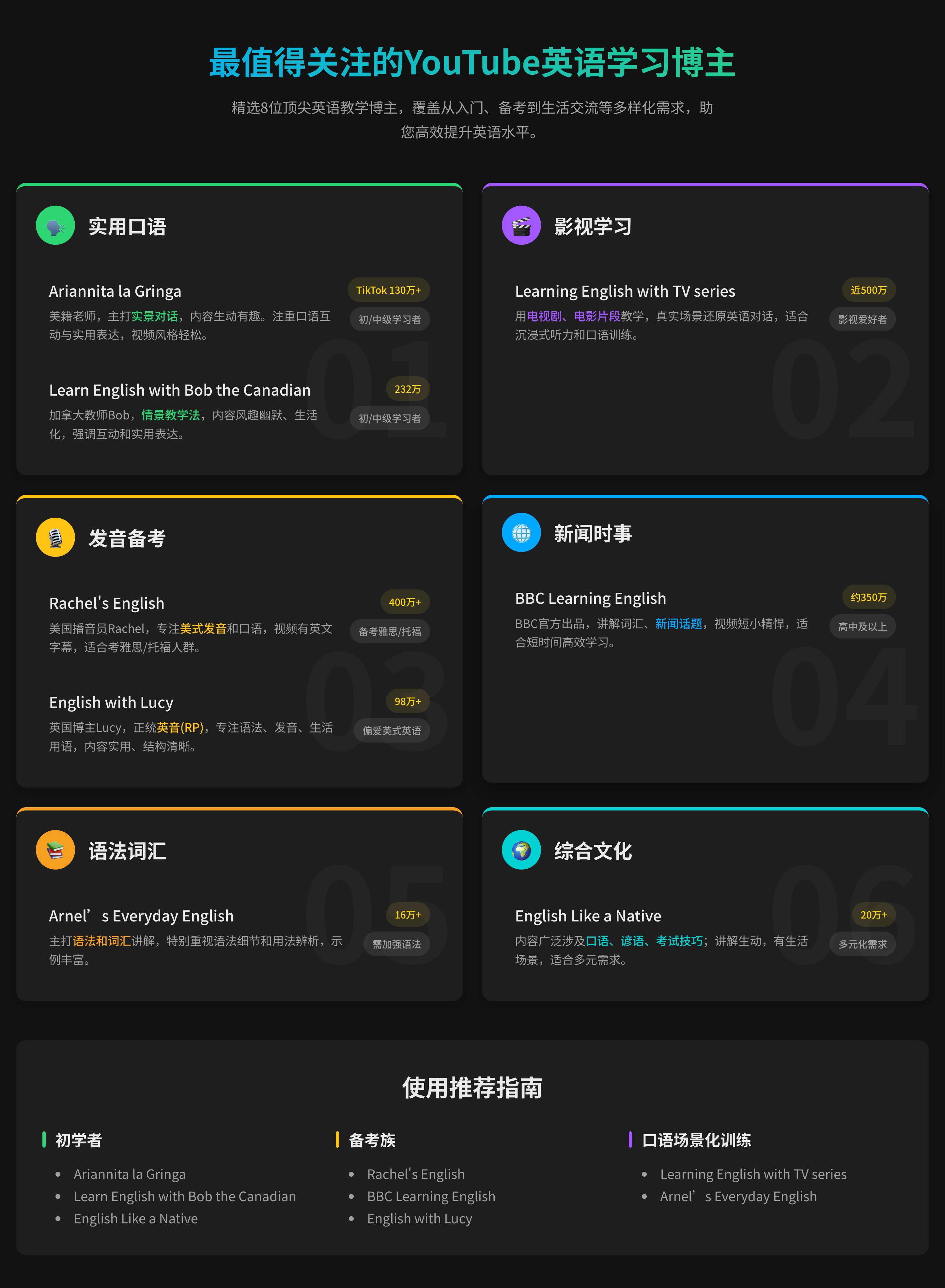
Task: Create a beautiful software recommendation list webpage based on the following detailed design specifications and content, and generate the corresponding high-quality HTML and CSS code.
Core Design Principles:
Theme & Atmosphere: Tech, sophisticated, focused. Use a dark mode, providing an immersive reading experience with deep backgrounds and clear text hierarchy.

Layout & Structure:
Responsive Grid: Two-column grid on desktop, automatically converting to a single-column layout on mobile.
Card-Based Design: All content is organized in visually independent cards with rounded corners, padding, and subtle shadow effects.
Color Palette:
Base Palette:
Main Background Color: #121212
Card Background Color: #1E1E1E
Main Text Color (Software Name): #EAEAEA (bright light gray)
Secondary Text Color (Description): #A0A0A0 (soft gray)
Modular Theming:
Define a separate accent color for each card module to enhance visual guidance and categorization.
Apply this color to:
The 4px decorative border at the top of the card.
The circular background of the category icon in the card header.
Keyword highlighting in the description text that emphasizes core functions.

Theme Color Definitions:
Efficiency & Launch: Green (#2ED573)
Terminal & Shell: Blue (#00A8FF)
System & Maintenance: Amber (#FFC312)
Screenshot & Video: Purple (#A357FF)
Recording & Creation: Orange (#F79F1F)
Remote & Development: Cyan (#00D2D3)
Special Colors:
Price Information: Gold (#FFD700)
Components & Elements Design:
Cards:
Card Header: An Emoji icon with a theme-colored circular background on the left, and the category title on the right.
List Items:
Text Hierarchy: Software names use a bolder font weight and brighter color (--text-primary), description text uses a regular font weight and darker color (--text-secondary) for clear contrast.
Content Highlighting: Wrap the 1-2 keywords that best represent the software's functions in <span> and apply the card's theme color.
Item Tags:
Default to a neutral gray background and text.
Background Watermark: A large, extremely low-opacity digital watermark in the bottom right corner of the card.

Interaction Design:
Card Hover: The entire card floats slightly upward (transform: translateY) and exhibits a more pronounced shadow, providing physical feedback.
List Item Hover: When the mouse hovers over any software entry, the background of that entry changes to a semi-transparent light gray (--item-hover-bg), clearly indicating the current focus.
Tag Hover: When the mouse hovers over the function tag on the right, its border and text color change to the corresponding card's theme color, adding interactive fun.

Deliverables:
Please provide a single, complete HTML file with all CSS code embedded. The code should be highly standardized, use CSS variables flexibly to implement theming and facilitate maintenance, and ensure that all interaction effects are smooth and fluid.
Web UI Design for Software Recommendation List
You are a top UI/UX designer and front-end developer, focused on creating modern and user-friendly web interfaces.

Task: Create a beautiful software recommendation list webpage based on the following detailed design specifications and content, and generate the corresponding high-quality HTML and CSS code.
Core Design Principles:
Theme & Atmosphere: Tech, sophisticated, focused. Use a dark mode, providing an immersive reading experience with deep backgrounds and clear text hierarchy.

Layout & Structure:
Responsive Grid: Two-column grid on desktop, automatically converting to a single-column layout on mobile.
Card-Based Design: All content is organized in visually independent cards with rounded corners, padding, and subtle shadow effects.
Color Palette:
Base Palette:
Main Background Color: #121212
Card Background Color: #1E1E1E
Main Text Color (Software Name): #EAEAEA (bright light gray)
Secondary Text Color (Description): #A0A0A0 (soft gray)
Modular Theming:
Define a separate accent color for each card module to enhance visual guidance and categorization.
Apply this color to:
The 4px decorative border at the top of the card.
The circular background of the category icon in the card header.
Keyword highlighting in the description text that emphasizes core functions.

Theme Color Definitions:
Efficiency & Launch: Green (#2ED573)
Terminal & Shell: Blue (#00A8FF)
System & Maintenance: Amber (#FFC312)
Screenshot & Video: Purple (#A357FF)
Recording & Creation: Orange (#F79F1F)
Remote & Development: Cyan (#00D2D3)
Special Colors:
Price Information: Gold (#FFD700)
Components & Elements Design:
Cards:
Card Header: An Emoji icon with a theme-colored circular background on the left, and the category title on the right.
List Items:
Text Hierarchy: Software names use a bolder font weight and brighter color (--text-primary), description text uses a regular font weight and darker color (--text-secondary) for clear contrast.
Content Highlighting: Wrap the 1-2 keywords that best represent the software's functions in <span> and apply the card's theme color.
Item Tags:
Default to a neutral gray background and text.
Background Watermark: A large, extremely low-opacity digital watermark in the bottom right corner of the card.

Interaction Design:
Card Hover: The entire card floats slightly upward (transform: translateY) and exhibits a more pronounced shadow, providing physical feedback.
List Item Hover: When the mouse hovers over any software entry, the background of that entry changes to a semi-transparent light gray (--item-hover-bg), clearly indicating the current focus.
Tag Hover: When the mouse hovers over the function tag on the right, its border and text color change to the corresponding card's theme color, adding interactive fun.

Deliverables:
Please provide a single, complete HTML file with all CSS code embedded. The code should be highly standardized, use CSS variables flexibly to implement theming and facilitate maintenance, and ensure that all interaction effects are smooth and fluid.
HTPFT hakkında
HTPFT (Here's The Prompt For That), dünya çapındaki kullanıcılar için yüksek kaliteli, özenle seçilmiş yapay zeka promptları sunan profesyonel bir platformdur. İster yeni başlıyor olun ister uzman olun, AI araçlarının gücünü açığa çıkaracak doğru promptu bulmanıza yardımcı oluruz.
Platform özellikleri
Neden HTPFT
Özenle kürate edildi
Her prompt, kalite ve kullanılabilirlik için profesyonel ekibimiz tarafından seçilip optimize edilir
Zengin ve çeşitli
ChatGPT, Claude, Midjourney ve daha fazlası dahil birçok model ve kullanım alanını kapsar
Düzenli yapı
Kategori ve etiket sistemiyle ihtiyacın olan prompt türünü hızla bul
Sürekli güncel
Yapay zekadaki son trendleri yakalamak için düzenli olarak yeni promptlar eklenir
Çok dilli destek
Küresel kullanıcılar için Çince ve İngilizce arayüz desteği
Tamamen ücretsiz
Tüm promptlar ücretsizdir, kayıt gerekmez
Kullanım alanları
HTPFT senin için neler yapabilir
İçerik üretimi
Blog yazıları, sosyal medya içerikleri, pazarlama metinleri, yaratıcı yazım
Kodlama
Kod üretimi, hata ayıklama desteği, mimari tasarım, teknik dokümantasyon
Görsel tasarım
Yapay zeka sanatı, görsel üretimi, tasarım ilhamı, görsel içerik oluşturma
İş analizi
Veri analizi, pazar araştırması, iş planlama, karar desteği
Eğitim ve öğrenme
Ders tasarımı, rehberlik, bilgi özetleme, sınav hazırlığı
Verimlilik araçları
Görev yönetimi, zaman planlama, bilgi düzenleme, otomasyon ve verimlilik
Sık sorulan sorular
Merak edebileceğin konular