
web-design
Categories
AI Models
Web UI Design for Software Recommendation List
GPTGraphic Design
입력 예시
프롬프트
You are a top UI/UX designer and front-end developer, focused on creating modern and user-friendly web interfaces.

Task: Create a beautiful software recommendation list webpage based on the following detailed design specifications and content, and generate the corresponding high-quality HTML and CSS code.
Core Design Principles:
Theme & Atmosphere: Tech, sophisticated, focused. Use a dark mode, providing an immersive reading experience with deep backgrounds and clear text hierarchy.

Layout & Structure:
Responsive Grid: Two-column grid on desktop, automatically converting to a single-column layout on mobile.
Card-Based Design: All content is organized in visually independent cards with rounded corners, padding, and subtle shadow effects.
Color Palette:
Base Palette:
Main Background Color: #121212
Card Background Color: #1E1E1E
Main Text Color (Software Name): #EAEAEA (bright light gray)
Secondary Text Color (Description): #A0A0A0 (soft gray)
Modular Theming:
Define a separate accent color for each card module to enhance visual guidance and categorization.
Apply this color to:
The 4px decorative border at the top of the card.
The circular background of the category icon in the card header.
Keyword highlighting in the description text that emphasizes core functions.

Theme Color Definitions:
Efficiency & Launch: Green (#2ED573)
Terminal & Shell: Blue (#00A8FF)
System & Maintenance: Amber (#FFC312)
Screenshot & Video: Purple (#A357FF)
Recording & Creation: Orange (#F79F1F)
Remote & Development: Cyan (#00D2D3)
Special Colors:
Price Information: Gold (#FFD700)
Components & Elements Design:
Cards:
Card Header: An Emoji icon with a theme-colored circular background on the left, and the category title on the right.
List Items:
Text Hierarchy: Software names use a bolder font weight and brighter color (--text-primary), description text uses a regular font weight and darker color (--text-secondary) for clear contrast.
Content Highlighting: Wrap the 1-2 keywords that best represent the software's functions in <span> and apply the card's theme color.
Item Tags:
Default to a neutral gray background and text.
Background Watermark: A large, extremely low-opacity digital watermark in the bottom right corner of the card.

Interaction Design:
Card Hover: The entire card floats slightly upward (transform: translateY) and exhibits a more pronounced shadow, providing physical feedback.
List Item Hover: When the mouse hovers over any software entry, the background of that entry changes to a semi-transparent light gray (--item-hover-bg), clearly indicating the current focus.
Tag Hover: When the mouse hovers over the function tag on the right, its border and text color change to the corresponding card's theme color, adding interactive fun.

Deliverables:
Please provide a single, complete HTML file with all CSS code embedded. The code should be highly standardized, use CSS variables flexibly to implement theming and facilitate maintenance, and ensure that all interaction effects are smooth and fluid.
전체 보기
출력 결과
이미지
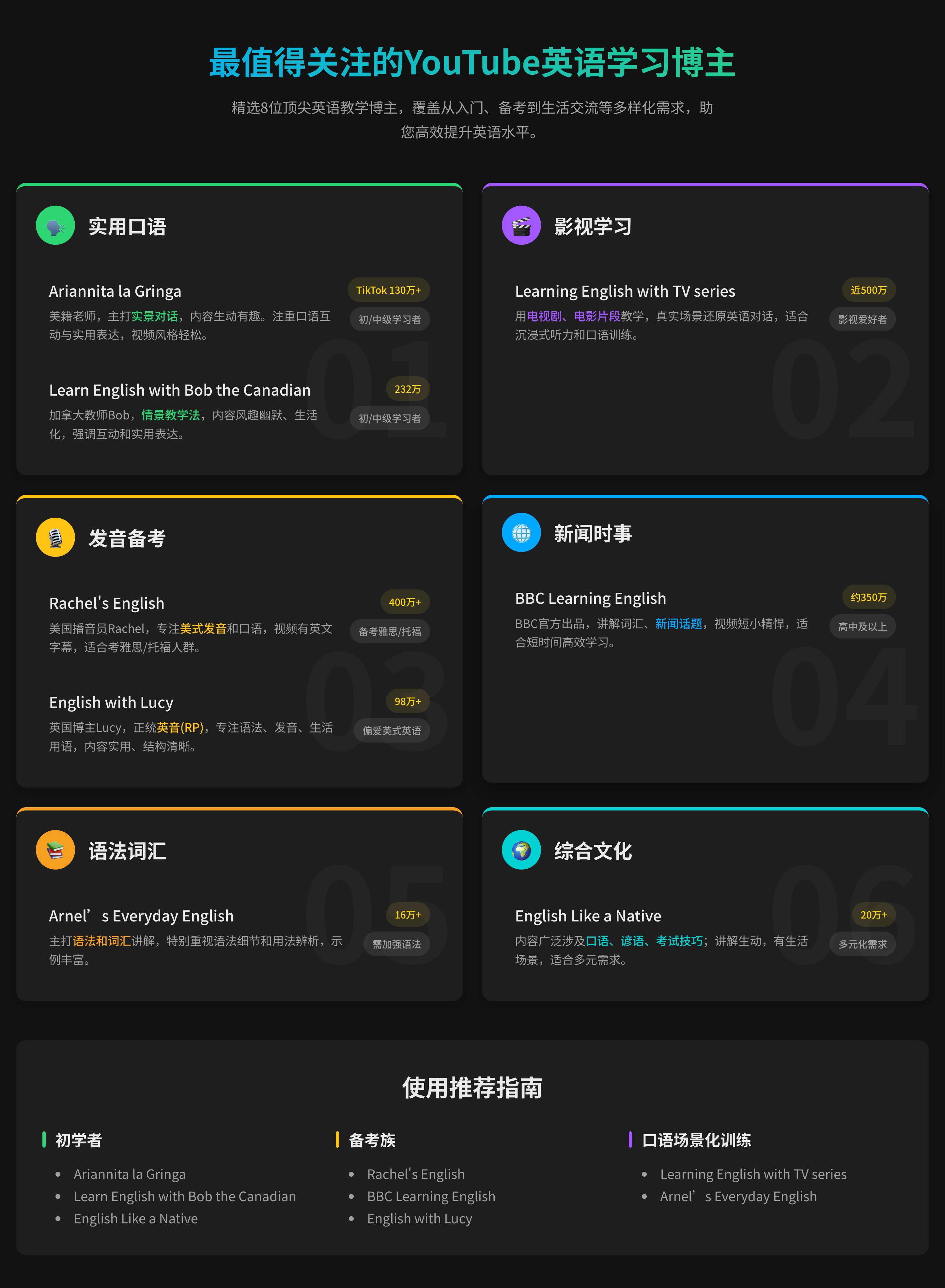
UI/UXweb-designdark-mode+3
Web UI Design for Software Recommendation List
GPTGraphic Design
입력 예시
프롬프트
You are a top UI/UX designer and front-end developer, focused on creating modern and user-friendly web interfaces.

Task: Create a beautiful software recommendation list webpage based on the following detailed design specifications and content, and generate the corresponding high-quality HTML and CSS code.
Core Design Principles:
Theme & Atmosphere: Tech, sophisticated, focused. Use a dark mode, providing an immersive reading experience with deep backgrounds and clear text hierarchy.

Layout & Structure:
Responsive Grid: Two-column grid on desktop, automatically converting to a single-column layout on mobile.
Card-Based Design: All content is organized in visually independent cards with rounded corners, padding, and subtle shadow effects.
Color Palette:
Base Palette:
Main Background Color: #121212
Card Background Color: #1E1E1E
Main Text Color (Software Name): #EAEAEA (bright light gray)
Secondary Text Color (Description): #A0A0A0 (soft gray)
Modular Theming:
Define a separate accent color for each card module to enhance visual guidance and categorization.
Apply this color to:
The 4px decorative border at the top of the card.
The circular background of the category icon in the card header.
Keyword highlighting in the description text that emphasizes core functions.

Theme Color Definitions:
Efficiency & Launch: Green (#2ED573)
Terminal & Shell: Blue (#00A8FF)
System & Maintenance: Amber (#FFC312)
Screenshot & Video: Purple (#A357FF)
Recording & Creation: Orange (#F79F1F)
Remote & Development: Cyan (#00D2D3)
Special Colors:
Price Information: Gold (#FFD700)
Components & Elements Design:
Cards:
Card Header: An Emoji icon with a theme-colored circular background on the left, and the category title on the right.
List Items:
Text Hierarchy: Software names use a bolder font weight and brighter color (--text-primary), description text uses a regular font weight and darker color (--text-secondary) for clear contrast.
Content Highlighting: Wrap the 1-2 keywords that best represent the software's functions in <span> and apply the card's theme color.
Item Tags:
Default to a neutral gray background and text.
Background Watermark: A large, extremely low-opacity digital watermark in the bottom right corner of the card.

Interaction Design:
Card Hover: The entire card floats slightly upward (transform: translateY) and exhibits a more pronounced shadow, providing physical feedback.
List Item Hover: When the mouse hovers over any software entry, the background of that entry changes to a semi-transparent light gray (--item-hover-bg), clearly indicating the current focus.
Tag Hover: When the mouse hovers over the function tag on the right, its border and text color change to the corresponding card's theme color, adding interactive fun.

Deliverables:
Please provide a single, complete HTML file with all CSS code embedded. The code should be highly standardized, use CSS variables flexibly to implement theming and facilitate maintenance, and ensure that all interaction effects are smooth and fluid.
전체 보기
출력 결과
이미지
UI/UXweb-designdark-mode+3
HTPFT 소개
HTPFT(Here's The Prompt For That)는 전 세계 사용자에게 고품질로 엄선된 AI 프롬프트를 제공하는 전문 라이브러리 플랫폼입니다. AI 초보자든 전문가든 누구나 최적의 프롬프트를 찾아 AI 도구의 잠재력을 끌어낼 수 있도록 돕습니다.
플랫폼 특징
왜 HTPFT인가
철저한 큐레이션
전문 팀이 모든 프롬프트를 선별·최적화해 품질과 실용성을 보장합니다
풍부한 다양성
ChatGPT, Claude, Midjourney 등 다양한 모델과 활용 사례를 포함합니다
체계적인 구성
카테고리와 태그 시스템으로 필요한 프롬프트를 빠르게 찾을 수 있습니다
지속적인 업데이트
최신 AI 트렌드에 맞춰 정기적으로 새 프롬프트를 추가합니다
다국어 지원
중국어와 영어 인터페이스를 지원해 글로벌 사용자를 만족시킵니다
완전 무료
모든 프롬프트를 무료로 이용할 수 있으며 가입이 필요 없습니다
활용 사례
HTPFT가 제공하는 가치
01
콘텐츠 제작
블로그 글, SNS 콘텐츠, 마케팅 카피, 창작 글 등
02
프로그래밍
코드 생성, 디버깅 지원, 아키텍처 설계, 기술 문서 작성
03
비주얼 디자인
AI 아트, 이미지 생성, 디자인 영감, 시각 콘텐츠 제작
04
비즈니스 분석
데이터 분석, 시장 조사, 비즈니스 기획, 의사결정 지원
05
교육 및 학습
커리큘럼 설계, 튜터링, 지식 요약, 시험 준비
06
생산성 도구
업무 관리, 일정 계획, 정보 정리, 자동화 및 효율 향상
자주 묻는 질문
궁금할 수 있는 내용