
UI/UX
Categories
AI Models
Web UI Design for Software Recommendation List
GPTGraphic Design
入力例
プロンプト
You are a top UI/UX designer and front-end developer, focused on creating modern and user-friendly web interfaces.

Task: Create a beautiful software recommendation list webpage based on the following detailed design specifications and content, and generate the corresponding high-quality HTML and CSS code.
Core Design Principles:
Theme & Atmosphere: Tech, sophisticated, focused. Use a dark mode, providing an immersive reading experience with deep backgrounds and clear text hierarchy.

Layout & Structure:
Responsive Grid: Two-column grid on desktop, automatically converting to a single-column layout on mobile.
Card-Based Design: All content is organized in visually independent cards with rounded corners, padding, and subtle shadow effects.
Color Palette:
Base Palette:
Main Background Color: #121212
Card Background Color: #1E1E1E
Main Text Color (Software Name): #EAEAEA (bright light gray)
Secondary Text Color (Description): #A0A0A0 (soft gray)
Modular Theming:
Define a separate accent color for each card module to enhance visual guidance and categorization.
Apply this color to:
The 4px decorative border at the top of the card.
The circular background of the category icon in the card header.
Keyword highlighting in the description text that emphasizes core functions.

Theme Color Definitions:
Efficiency & Launch: Green (#2ED573)
Terminal & Shell: Blue (#00A8FF)
System & Maintenance: Amber (#FFC312)
Screenshot & Video: Purple (#A357FF)
Recording & Creation: Orange (#F79F1F)
Remote & Development: Cyan (#00D2D3)
Special Colors:
Price Information: Gold (#FFD700)
Components & Elements Design:
Cards:
Card Header: An Emoji icon with a theme-colored circular background on the left, and the category title on the right.
List Items:
Text Hierarchy: Software names use a bolder font weight and brighter color (--text-primary), description text uses a regular font weight and darker color (--text-secondary) for clear contrast.
Content Highlighting: Wrap the 1-2 keywords that best represent the software's functions in <span> and apply the card's theme color.
Item Tags:
Default to a neutral gray background and text.
Background Watermark: A large, extremely low-opacity digital watermark in the bottom right corner of the card.

Interaction Design:
Card Hover: The entire card floats slightly upward (transform: translateY) and exhibits a more pronounced shadow, providing physical feedback.
List Item Hover: When the mouse hovers over any software entry, the background of that entry changes to a semi-transparent light gray (--item-hover-bg), clearly indicating the current focus.
Tag Hover: When the mouse hovers over the function tag on the right, its border and text color change to the corresponding card's theme color, adding interactive fun.

Deliverables:
Please provide a single, complete HTML file with all CSS code embedded. The code should be highly standardized, use CSS variables flexibly to implement theming and facilitate maintenance, and ensure that all interaction effects are smooth and fluid.
全文を見る
出力例
画像
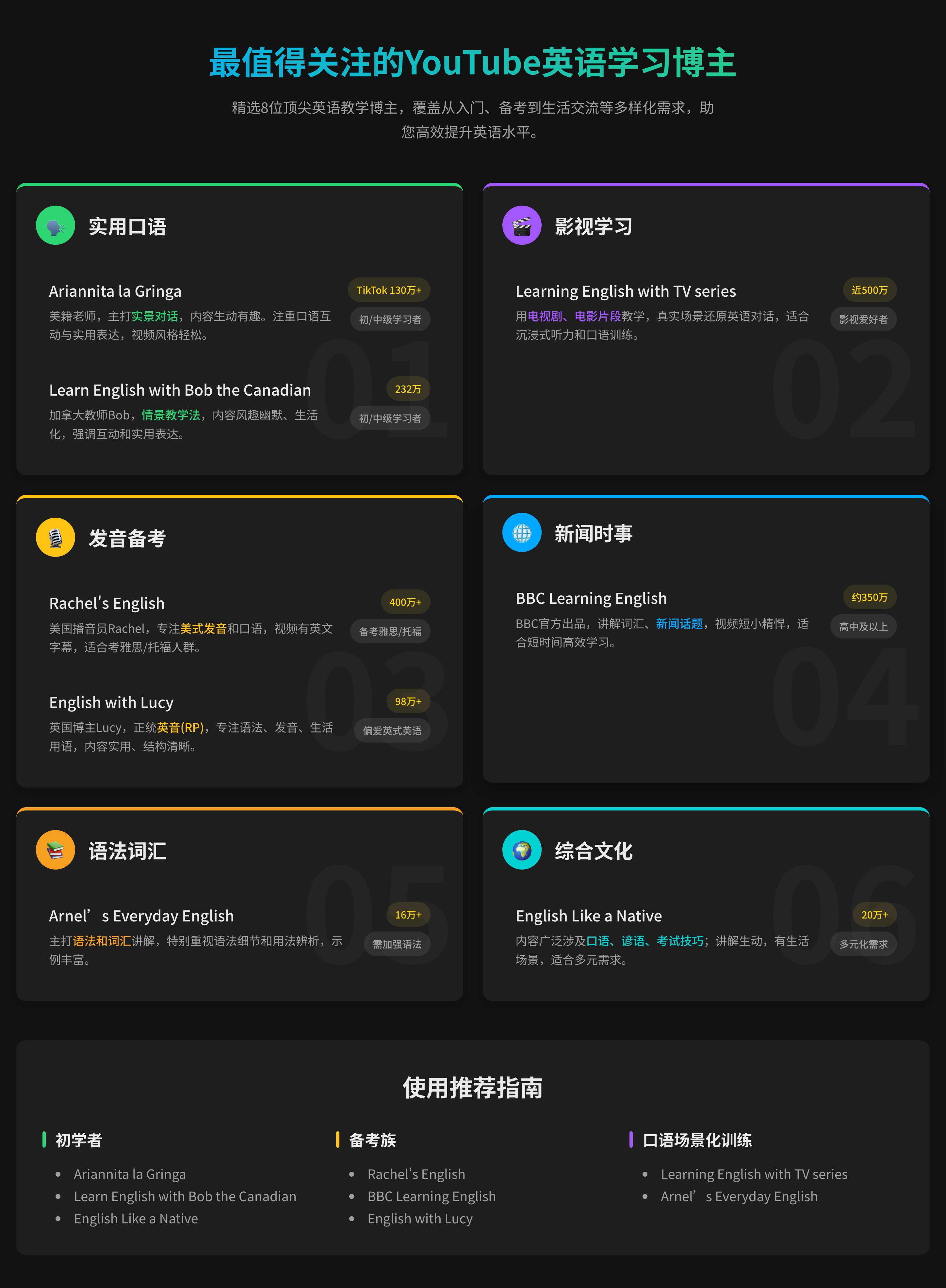
UI/UXweb-designdark-mode+3
Web UI Design for Software Recommendation List
GPTGraphic Design
入力例
プロンプト
You are a top UI/UX designer and front-end developer, focused on creating modern and user-friendly web interfaces.

Task: Create a beautiful software recommendation list webpage based on the following detailed design specifications and content, and generate the corresponding high-quality HTML and CSS code.
Core Design Principles:
Theme & Atmosphere: Tech, sophisticated, focused. Use a dark mode, providing an immersive reading experience with deep backgrounds and clear text hierarchy.

Layout & Structure:
Responsive Grid: Two-column grid on desktop, automatically converting to a single-column layout on mobile.
Card-Based Design: All content is organized in visually independent cards with rounded corners, padding, and subtle shadow effects.
Color Palette:
Base Palette:
Main Background Color: #121212
Card Background Color: #1E1E1E
Main Text Color (Software Name): #EAEAEA (bright light gray)
Secondary Text Color (Description): #A0A0A0 (soft gray)
Modular Theming:
Define a separate accent color for each card module to enhance visual guidance and categorization.
Apply this color to:
The 4px decorative border at the top of the card.
The circular background of the category icon in the card header.
Keyword highlighting in the description text that emphasizes core functions.

Theme Color Definitions:
Efficiency & Launch: Green (#2ED573)
Terminal & Shell: Blue (#00A8FF)
System & Maintenance: Amber (#FFC312)
Screenshot & Video: Purple (#A357FF)
Recording & Creation: Orange (#F79F1F)
Remote & Development: Cyan (#00D2D3)
Special Colors:
Price Information: Gold (#FFD700)
Components & Elements Design:
Cards:
Card Header: An Emoji icon with a theme-colored circular background on the left, and the category title on the right.
List Items:
Text Hierarchy: Software names use a bolder font weight and brighter color (--text-primary), description text uses a regular font weight and darker color (--text-secondary) for clear contrast.
Content Highlighting: Wrap the 1-2 keywords that best represent the software's functions in <span> and apply the card's theme color.
Item Tags:
Default to a neutral gray background and text.
Background Watermark: A large, extremely low-opacity digital watermark in the bottom right corner of the card.

Interaction Design:
Card Hover: The entire card floats slightly upward (transform: translateY) and exhibits a more pronounced shadow, providing physical feedback.
List Item Hover: When the mouse hovers over any software entry, the background of that entry changes to a semi-transparent light gray (--item-hover-bg), clearly indicating the current focus.
Tag Hover: When the mouse hovers over the function tag on the right, its border and text color change to the corresponding card's theme color, adding interactive fun.

Deliverables:
Please provide a single, complete HTML file with all CSS code embedded. The code should be highly standardized, use CSS variables flexibly to implement theming and facilitate maintenance, and ensure that all interaction effects are smooth and fluid.
全文を見る
出力例
画像
UI/UXweb-designdark-mode+3
HTPFT について
HTPFT(Here's The Prompt For That)は、世界中のユーザーに高品質で厳選された AI プロンプトを提供する専門プラットフォームです。AI ビギナーからプロフェッショナルまで、最適なプロンプトを見つけて AI ツールの可能性を最大化できるよう支援します。
プラットフォームの特長
HTPFT を選ぶ理由
厳選された品質
専門チームがすべてのプロンプトを選定・最適化し、品質と実用性を保証
豊富で多様
ChatGPT、Claude、Midjourney など複数のモデルとユースケースを網羅
整理された構造
カテゴリとタグシステムで必要なプロンプトを素早く検索
継続的なアップデート
最新の AI トレンドに合わせて新しいプロンプトを定期的に追加
多言語対応
中国語と英語の両方に対応し、世界中のユーザーに対応
完全無料
すべてのプロンプトを無料で利用でき、登録は不要
ユースケース
HTPFT でできること
01
コンテンツ制作
ブログ記事、SNS 投稿、マーケティングコピー、クリエイティブライティングなど
02
プログラミング
コード生成、デバッグ支援、アーキテクチャ設計、技術ドキュメント作成
03
ビジュアルデザイン
AI アート、画像生成、デザインのインスピレーション、ビジュアル制作
04
ビジネス分析
データ分析、市場調査、事業計画、意思決定支援
05
教育と学習
カリキュラム設計、チュータリング、知識の要約、試験対策
06
生産性向上
タスク管理、時間計画、情報整理、自動化、効率化
よくある質問
気になる疑問にお答えします