
UI/UX
Categories
AI Models
Web UI Design for Software Recommendation List
You are a top UI/UX designer and front-end developer, focused on creating modern and user-friendly web interfaces.

Task: Create a beautiful software recommendation list webpage based on the following detailed design specifications and content, and generate the corresponding high-quality HTML and CSS code.
Core Design Principles:
Theme & Atmosphere: Tech, sophisticated, focused. Use a dark mode, providing an immersive reading experience with deep backgrounds and clear text hierarchy.

Layout & Structure:
Responsive Grid: Two-column grid on desktop, automatically converting to a single-column layout on mobile.
Card-Based Design: All content is organized in visually independent cards with rounded corners, padding, and subtle shadow effects.
Color Palette:
Base Palette:
Main Background Color: #121212
Card Background Color: #1E1E1E
Main Text Color (Software Name): #EAEAEA (bright light gray)
Secondary Text Color (Description): #A0A0A0 (soft gray)
Modular Theming:
Define a separate accent color for each card module to enhance visual guidance and categorization.
Apply this color to:
The 4px decorative border at the top of the card.
The circular background of the category icon in the card header.
Keyword highlighting in the description text that emphasizes core functions.

Theme Color Definitions:
Efficiency & Launch: Green (#2ED573)
Terminal & Shell: Blue (#00A8FF)
System & Maintenance: Amber (#FFC312)
Screenshot & Video: Purple (#A357FF)
Recording & Creation: Orange (#F79F1F)
Remote & Development: Cyan (#00D2D3)
Special Colors:
Price Information: Gold (#FFD700)
Components & Elements Design:
Cards:
Card Header: An Emoji icon with a theme-colored circular background on the left, and the category title on the right.
List Items:
Text Hierarchy: Software names use a bolder font weight and brighter color (--text-primary), description text uses a regular font weight and darker color (--text-secondary) for clear contrast.
Content Highlighting: Wrap the 1-2 keywords that best represent the software's functions in <span> and apply the card's theme color.
Item Tags:
Default to a neutral gray background and text.
Background Watermark: A large, extremely low-opacity digital watermark in the bottom right corner of the card.

Interaction Design:
Card Hover: The entire card floats slightly upward (transform: translateY) and exhibits a more pronounced shadow, providing physical feedback.
List Item Hover: When the mouse hovers over any software entry, the background of that entry changes to a semi-transparent light gray (--item-hover-bg), clearly indicating the current focus.
Tag Hover: When the mouse hovers over the function tag on the right, its border and text color change to the corresponding card's theme color, adding interactive fun.

Deliverables:
Please provide a single, complete HTML file with all CSS code embedded. The code should be highly standardized, use CSS variables flexibly to implement theming and facilitate maintenance, and ensure that all interaction effects are smooth and fluid.
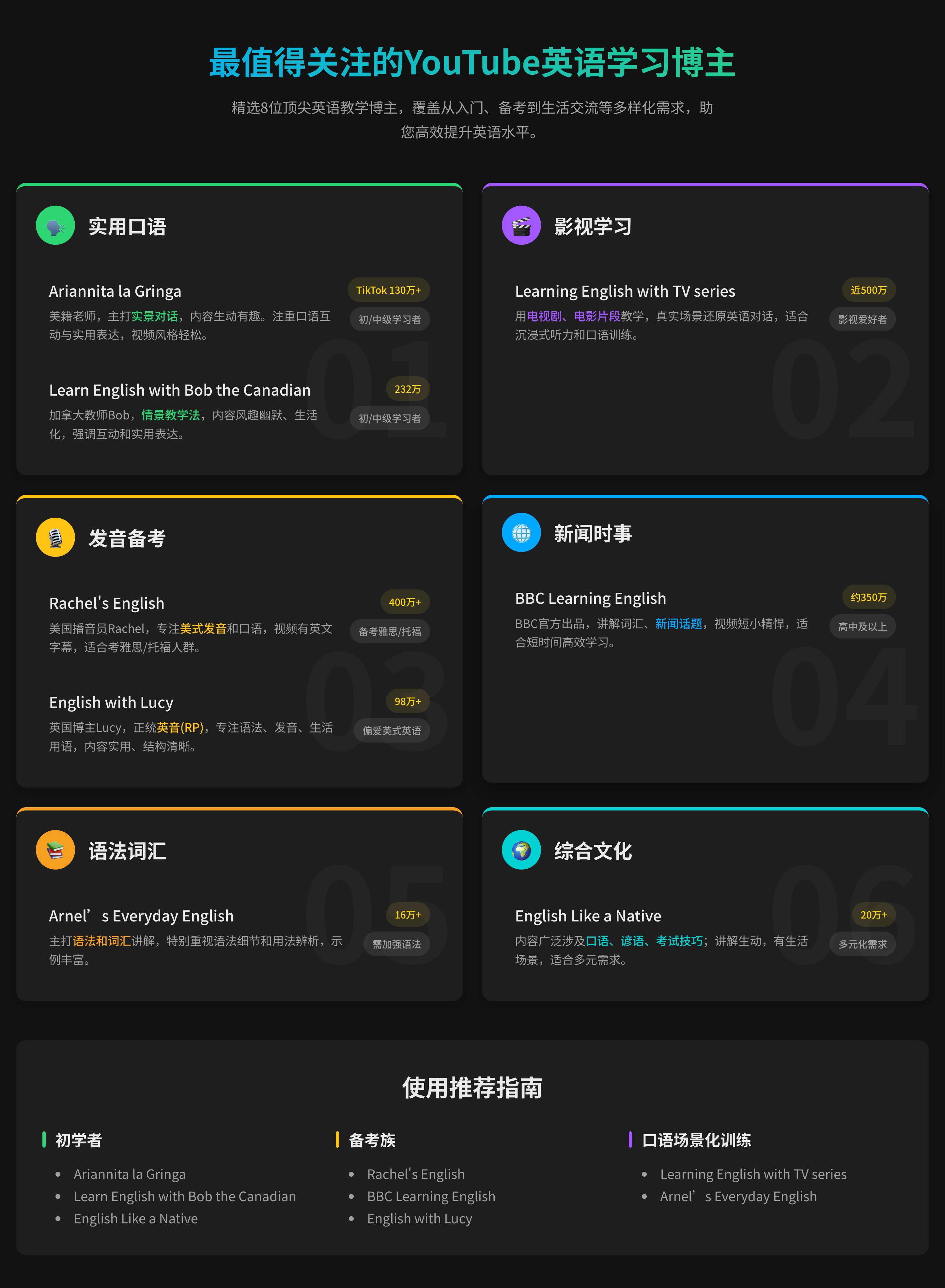
Web UI Design for Software Recommendation List
You are a top UI/UX designer and front-end developer, focused on creating modern and user-friendly web interfaces.

Task: Create a beautiful software recommendation list webpage based on the following detailed design specifications and content, and generate the corresponding high-quality HTML and CSS code.
Core Design Principles:
Theme & Atmosphere: Tech, sophisticated, focused. Use a dark mode, providing an immersive reading experience with deep backgrounds and clear text hierarchy.

Layout & Structure:
Responsive Grid: Two-column grid on desktop, automatically converting to a single-column layout on mobile.
Card-Based Design: All content is organized in visually independent cards with rounded corners, padding, and subtle shadow effects.
Color Palette:
Base Palette:
Main Background Color: #121212
Card Background Color: #1E1E1E
Main Text Color (Software Name): #EAEAEA (bright light gray)
Secondary Text Color (Description): #A0A0A0 (soft gray)
Modular Theming:
Define a separate accent color for each card module to enhance visual guidance and categorization.
Apply this color to:
The 4px decorative border at the top of the card.
The circular background of the category icon in the card header.
Keyword highlighting in the description text that emphasizes core functions.

Theme Color Definitions:
Efficiency & Launch: Green (#2ED573)
Terminal & Shell: Blue (#00A8FF)
System & Maintenance: Amber (#FFC312)
Screenshot & Video: Purple (#A357FF)
Recording & Creation: Orange (#F79F1F)
Remote & Development: Cyan (#00D2D3)
Special Colors:
Price Information: Gold (#FFD700)
Components & Elements Design:
Cards:
Card Header: An Emoji icon with a theme-colored circular background on the left, and the category title on the right.
List Items:
Text Hierarchy: Software names use a bolder font weight and brighter color (--text-primary), description text uses a regular font weight and darker color (--text-secondary) for clear contrast.
Content Highlighting: Wrap the 1-2 keywords that best represent the software's functions in <span> and apply the card's theme color.
Item Tags:
Default to a neutral gray background and text.
Background Watermark: A large, extremely low-opacity digital watermark in the bottom right corner of the card.

Interaction Design:
Card Hover: The entire card floats slightly upward (transform: translateY) and exhibits a more pronounced shadow, providing physical feedback.
List Item Hover: When the mouse hovers over any software entry, the background of that entry changes to a semi-transparent light gray (--item-hover-bg), clearly indicating the current focus.
Tag Hover: When the mouse hovers over the function tag on the right, its border and text color change to the corresponding card's theme color, adding interactive fun.

Deliverables:
Please provide a single, complete HTML file with all CSS code embedded. The code should be highly standardized, use CSS variables flexibly to implement theming and facilitate maintenance, and ensure that all interaction effects are smooth and fluid.
Sobre HTPFT
HTPFT (Here's The Prompt For That) es una plataforma profesional de biblioteca de prompts dedicada a ofrecer prompts de IA de alta calidad y cuidadosamente seleccionados para usuarios de todo el mundo. Tanto si eres principiante como profesional, te ayudamos a encontrar el prompt perfecto para desbloquear todo el potencial de las herramientas de IA.
Características de la plataforma
Por qué elegir HTPFT
Selección cuidadosa
Cada prompt es seleccionado y optimizado por nuestro equipo para garantizar calidad y utilidad
Rico y diverso
Cubrimos múltiples modelos y casos de uso, incluyendo ChatGPT, Claude, Midjourney y más
Bien organizado
Encuentra rápidamente el tipo de prompt que necesitas mediante nuestro sistema de categorías y etiquetas
Actualizado continuamente
Añadimos prompts nuevos con frecuencia para mantenernos al día con las tendencias de la IA
Soporte multilingüe
Interfaz en chino e inglés para satisfacer a usuarios de todo el mundo
Completamente gratis
Todos los prompts son gratuitos y no necesitas registrarte
Casos de uso
Lo que HTPFT puede hacer por ti
Creación de contenido
Publicaciones de blog, contenido para redes sociales, copys de marketing, escritura creativa y más
Programación
Generación de código, ayuda para depurar, diseño de arquitectura, documentación técnica y escenarios de desarrollo
Diseño visual
Arte con IA, generación de imágenes, inspiración de diseño, creación artística y producción visual
Análisis de negocios
Análisis de datos, investigación de mercado, planificación empresarial, soporte a decisiones y aplicaciones comerciales
Educación y aprendizaje
Diseño de cursos, tutoría, resúmenes de conocimiento, preparación de exámenes y formación educativa
Herramientas de productividad
Gestión de tareas, planificación del tiempo, organización de información, automatización y eficiencia
Preguntas frecuentes
Lo que quizá quieras saber