
UI/UX
Categories
AI Models
Web UI Design for Software Recommendation List
You are a top UI/UX designer and front-end developer, focused on creating modern and user-friendly web interfaces.

Task: Create a beautiful software recommendation list webpage based on the following detailed design specifications and content, and generate the corresponding high-quality HTML and CSS code.
Core Design Principles:
Theme & Atmosphere: Tech, sophisticated, focused. Use a dark mode, providing an immersive reading experience with deep backgrounds and clear text hierarchy.

Layout & Structure:
Responsive Grid: Two-column grid on desktop, automatically converting to a single-column layout on mobile.
Card-Based Design: All content is organized in visually independent cards with rounded corners, padding, and subtle shadow effects.
Color Palette:
Base Palette:
Main Background Color: #121212
Card Background Color: #1E1E1E
Main Text Color (Software Name): #EAEAEA (bright light gray)
Secondary Text Color (Description): #A0A0A0 (soft gray)
Modular Theming:
Define a separate accent color for each card module to enhance visual guidance and categorization.
Apply this color to:
The 4px decorative border at the top of the card.
The circular background of the category icon in the card header.
Keyword highlighting in the description text that emphasizes core functions.

Theme Color Definitions:
Efficiency & Launch: Green (#2ED573)
Terminal & Shell: Blue (#00A8FF)
System & Maintenance: Amber (#FFC312)
Screenshot & Video: Purple (#A357FF)
Recording & Creation: Orange (#F79F1F)
Remote & Development: Cyan (#00D2D3)
Special Colors:
Price Information: Gold (#FFD700)
Components & Elements Design:
Cards:
Card Header: An Emoji icon with a theme-colored circular background on the left, and the category title on the right.
List Items:
Text Hierarchy: Software names use a bolder font weight and brighter color (--text-primary), description text uses a regular font weight and darker color (--text-secondary) for clear contrast.
Content Highlighting: Wrap the 1-2 keywords that best represent the software's functions in <span> and apply the card's theme color.
Item Tags:
Default to a neutral gray background and text.
Background Watermark: A large, extremely low-opacity digital watermark in the bottom right corner of the card.

Interaction Design:
Card Hover: The entire card floats slightly upward (transform: translateY) and exhibits a more pronounced shadow, providing physical feedback.
List Item Hover: When the mouse hovers over any software entry, the background of that entry changes to a semi-transparent light gray (--item-hover-bg), clearly indicating the current focus.
Tag Hover: When the mouse hovers over the function tag on the right, its border and text color change to the corresponding card's theme color, adding interactive fun.

Deliverables:
Please provide a single, complete HTML file with all CSS code embedded. The code should be highly standardized, use CSS variables flexibly to implement theming and facilitate maintenance, and ensure that all interaction effects are smooth and fluid.
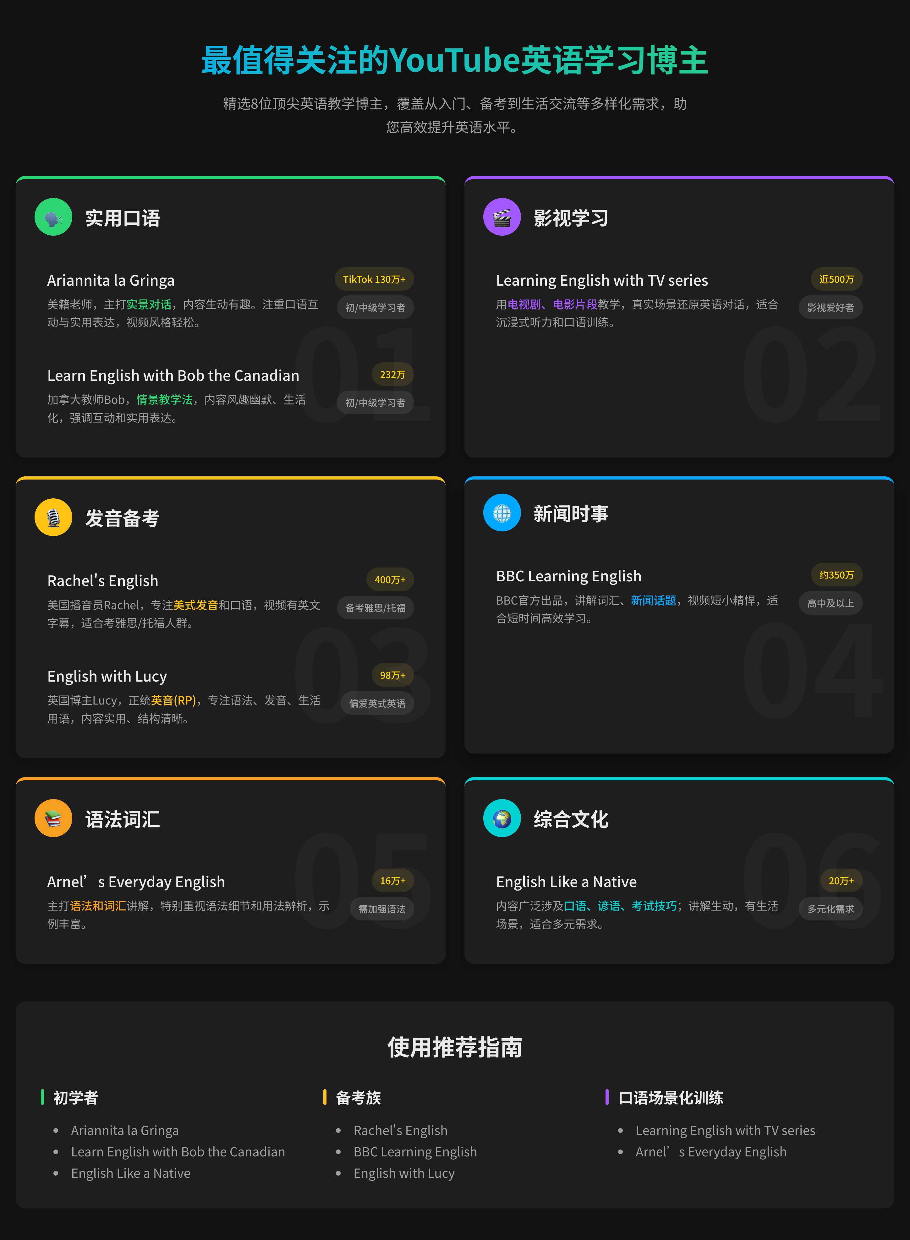
Web UI Design for Software Recommendation List
You are a top UI/UX designer and front-end developer, focused on creating modern and user-friendly web interfaces.

Task: Create a beautiful software recommendation list webpage based on the following detailed design specifications and content, and generate the corresponding high-quality HTML and CSS code.
Core Design Principles:
Theme & Atmosphere: Tech, sophisticated, focused. Use a dark mode, providing an immersive reading experience with deep backgrounds and clear text hierarchy.

Layout & Structure:
Responsive Grid: Two-column grid on desktop, automatically converting to a single-column layout on mobile.
Card-Based Design: All content is organized in visually independent cards with rounded corners, padding, and subtle shadow effects.
Color Palette:
Base Palette:
Main Background Color: #121212
Card Background Color: #1E1E1E
Main Text Color (Software Name): #EAEAEA (bright light gray)
Secondary Text Color (Description): #A0A0A0 (soft gray)
Modular Theming:
Define a separate accent color for each card module to enhance visual guidance and categorization.
Apply this color to:
The 4px decorative border at the top of the card.
The circular background of the category icon in the card header.
Keyword highlighting in the description text that emphasizes core functions.

Theme Color Definitions:
Efficiency & Launch: Green (#2ED573)
Terminal & Shell: Blue (#00A8FF)
System & Maintenance: Amber (#FFC312)
Screenshot & Video: Purple (#A357FF)
Recording & Creation: Orange (#F79F1F)
Remote & Development: Cyan (#00D2D3)
Special Colors:
Price Information: Gold (#FFD700)
Components & Elements Design:
Cards:
Card Header: An Emoji icon with a theme-colored circular background on the left, and the category title on the right.
List Items:
Text Hierarchy: Software names use a bolder font weight and brighter color (--text-primary), description text uses a regular font weight and darker color (--text-secondary) for clear contrast.
Content Highlighting: Wrap the 1-2 keywords that best represent the software's functions in <span> and apply the card's theme color.
Item Tags:
Default to a neutral gray background and text.
Background Watermark: A large, extremely low-opacity digital watermark in the bottom right corner of the card.

Interaction Design:
Card Hover: The entire card floats slightly upward (transform: translateY) and exhibits a more pronounced shadow, providing physical feedback.
List Item Hover: When the mouse hovers over any software entry, the background of that entry changes to a semi-transparent light gray (--item-hover-bg), clearly indicating the current focus.
Tag Hover: When the mouse hovers over the function tag on the right, its border and text color change to the corresponding card's theme color, adding interactive fun.

Deliverables:
Please provide a single, complete HTML file with all CSS code embedded. The code should be highly standardized, use CSS variables flexibly to implement theming and facilitate maintenance, and ensure that all interaction effects are smooth and fluid.
About HTPFT
HTPFT (Here's The Prompt For That) is a professional AI prompt library platform dedicated to providing high-quality, carefully curated AI prompts for users worldwide. Whether you're an AI beginner or a professional, we help you find the perfect prompts to unlock the full potential of AI tools.
Platform Features
Why Choose HTPFT
Carefully Curated
Every prompt is carefully selected and optimized by our professional team to ensure quality and practicality
Rich & Diverse
Covering multiple AI models and use cases, including ChatGPT, Claude, Midjourney, and more
Well Organized
Quickly find the prompt types you need through our category and tag system
Continuously Updated
New prompts added regularly, keeping up with the latest AI technology trends
Multilingual Support
Support for both Chinese and English interfaces to meet global user needs
Completely Free
All prompts are completely free to use, no registration required
Use Cases
What HTPFT Can Do For You
Content Creation
Blog posts, social media content, marketing copy, creative writing, and various text creation needs
Programming
Code generation, debugging assistance, architecture design, technical documentation, and development scenarios
Visual Design
AI art, image generation, design inspiration, artistic creation, and visual content production
Business Analysis
Data analysis, market research, business planning, decision support, and business applications
Education & Learning
Course design, tutoring, knowledge summarization, exam preparation, and educational training
Productivity Tools
Task management, time planning, information organization, automation, and efficiency scenarios
Frequently Asked Questions
What You Might Want to Know